
Mathematics, 12.01.2021 20:10 emocow
1)
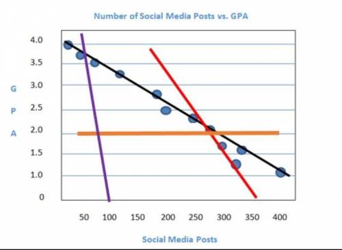
The scatterplot shows the relationship between the number of texts a student sends each week and the student's GPA. Which color is the line of best fit for the data points?
A) red
B) purple
C) black
D) orange
2)
Which should you consider when informally assessing whether a line is the best fit for the data on a scatter plot?
A) the range of the data points
B) the median of the data points
C) the outliers of the data points
D) the closeness of the data points

Answers: 1


Other questions on the subject: Mathematics
Mathematics, 21.06.2019 17:40, JordanJones04402
Given f(x)= 9x+1 and g(x)=x^3, choose the expression (f*g)(x)
Answers: 2
Mathematics, 21.06.2019 23:30, jadynsantiago
Ana earns 2.5% simple interest on $2,000 in her savings account. she does not make any deposits or withdrawals. after 3 years, how much interest will ana have earned on her savings account?
Answers: 1
You know the right answer?
1)
The scatterplot shows the relationship between the number of texts a student sends each week and...
Questions in other subjects:


Mathematics, 05.05.2020 03:01


