
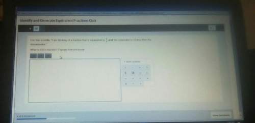
Mathematics, 06.01.2021 23:30 erieannapickett12
The scatterplot and regression line below show the relationship between how early students turned in an exam (measured by minutes remaining in the exam) and their exam scores.
The fitted line has a y-intercept of 87.
What is the best interpretation of this y-intercept?
Choose 1
A. The average score on the exam was approximately 87
B. On average, spending an extra 1 minute on the exam corresponded to an 87-point increase in score.
C. The model indicates that students who spent 5 minutes taking the exam will have an average score of approximately 87 points.
D. The model indicates that students who turned in the exam exactly at the end of the period will have an average score of 87 points.

Answers: 3


Other questions on the subject: Mathematics
Mathematics, 21.06.2019 12:50, Chartwig4576
Which is the most efficient first step to solve x in the equation 3.7x - 18 = -4.3x -34 a. add 3.7x to both sides of the equation. b. add 4.3x to both sides of the equation. c. subtract 18 from both sides of the equation. d. subtract 34 from both sides of the equation.
Answers: 3
Mathematics, 21.06.2019 23:00, erbnichole
Graph the system of equations on your graph paper to answer the question. {y=−x+4y=x−2 what is the solution for the system of equations? enter your answer in the boxes.
Answers: 1
Mathematics, 22.06.2019 00:10, chloeholt123
What 8/12+8/11 in another way than and improper fraction
Answers: 2
Mathematics, 22.06.2019 01:00, s27511583
The weight of 46 new patients of a clinic from the year 2018 are recorded and listed below. construct a frequency distribution, using 7 classes. then, draw a histogram, a frequency polygon, and an ogive for the data, using the relative information from the frequency table for each of the graphs. describe the shape of the histogram. data set: 130 192 145 97 100 122 210 132 107 95 210 128 193 208 118 196 130 178 187 240 90 126 98 194 115 212 110 225 187 133 220 218 110 104 201 120 183 124 261 270 108 160 203 210 191 180 1) complete the frequency distribution table below (add as many rows as needed): - class limits - class boundaries - midpoint - frequency - cumulative frequency 2) histogram 3) frequency polygon 4) ogive
Answers: 1
You know the right answer?
The scatterplot and regression line below show the relationship between how early students turned in...
Questions in other subjects:


Mathematics, 14.04.2020 17:58


