
Mathematics, 16.12.2020 21:20 kevo2024
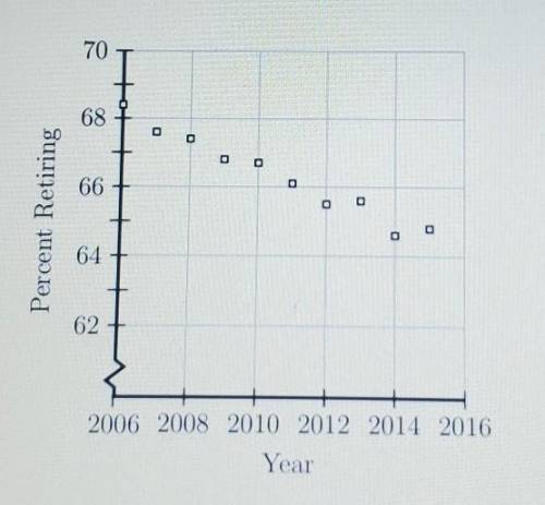
The scatterplot shown below represents data for each of the years from 2006 to 2015. The plot shows the percent of people 62 years of age and older who were working and then retired during each of those years. If this trend continued which of the following best predicts the percent who retired in 2016?
A.) 62%
B.) 64%
C.) 66%
D.) 68%

Answers: 2


Other questions on the subject: Mathematics
Mathematics, 21.06.2019 20:00, anabelleacunamu
Find the value of x. round the length to the nearest tenth
Answers: 1
Mathematics, 21.06.2019 21:40, Blakemiller2020
Which of the following best describes the graph below? + + 2 + 3 + 4 1 o a. it is not a function. o b. it is a one-to-one function. o c. it is a many-to-one function. o d. it is a function, but it is not one-to-one.
Answers: 3
You know the right answer?
The scatterplot shown below represents data for each of the years from 2006 to 2015. The plot shows...
Questions in other subjects:
Mathematics, 17.09.2019 16:10

Social Studies, 17.09.2019 16:10

English, 17.09.2019 16:10


Mathematics, 17.09.2019 16:10

Physics, 17.09.2019 16:10


