
Mathematics, 15.12.2020 22:00 liv467
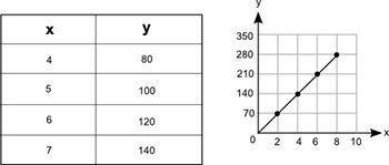
The table and the graph below each show a different relationship between the same two variables, x and y.
How much more would the value of y be on the graph than its value in the table when x = 12?
- 20
- 90
- 150
- 180

Answers: 3


Other questions on the subject: Mathematics
Mathematics, 21.06.2019 21:30, lainnn974
Questions 7-8. use the following table to answer. year 2006 2007 2008 2009 2010 2011 2012 2013 cpi 201.6 207.342 215.303 214.537 218.056 224.939 229.594 232.957 7. suppose you bought a house in 2006 for $120,000. use the table above to calculate the 2013 value adjusted for inflation. (round to the nearest whole number) 8. suppose you bought a house in 2013 for $90,000. use the table above to calculate the 2006 value adjusted for inflation. (round to the nearest whole number)
Answers: 3
Mathematics, 21.06.2019 22:30, sanociahnoel
Ibeg you to me 20. a reaction produces 4.93 l of oxygen, but was supposed to produce 1 mol of oxygen. what is the percent yield?
Answers: 3
Mathematics, 22.06.2019 00:00, christinavelez26
(50 ) mrs. julien’s and mrs. castillejo’s classes are selling cookie dough for a school fundraiser. customers can buy packages of macadamia nut chip cookie dough and packages of triple chocolate cookie dough. mrs. julien’s class sold 25 packages of macadamia nut chip cookie dough and 30 packages of triple chocolate cookie dough for a total of $221.25. mrs. castillejo’s class sold 5 packages of macadamia nut chip cookie dough and 45 packages of triple chocolate cookie dough for a total of $191.25. (a) write the system of equations that model the problem. be sure to explain which equation represents which situation. (b) find the cost of each type of cookie. show your work. (c) explain which method you used to solve the system and why you chose that method.
Answers: 1
Mathematics, 22.06.2019 00:30, ejones123
Select the correct answer. employee earnings per month($) 1 1,200 2 2,600 3 1,800 4 1,450 5 3,500 6 2,800 7 12,500 8 3,200 which measure of spread is best for the data in the table? a. range b. quartiles c. interquartile range d. mean absolute deviation
Answers: 2
You know the right answer?
The table and the graph below each show a different relationship between the same two variables, x a...
Questions in other subjects:

Social Studies, 07.05.2021 17:40
Mathematics, 07.05.2021 17:40
Mathematics, 07.05.2021 17:40
Mathematics, 07.05.2021 17:40

Mathematics, 07.05.2021 17:50


