
Mathematics, 03.07.2020 23:01 ytyugguuh56
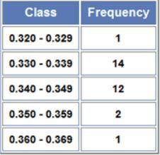
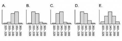
A frequency table for the 30 best lifetime baseball batting averages of all time is shown to the right. These data can be graphically displayed as a histogram. Which of the following graphs correctly displays the data from the table? A. Graph A B. Graph B C. Graph C D. Graph D E. Graph E

Answers: 3


Other questions on the subject: Mathematics
Mathematics, 21.06.2019 14:50, bustillojoshua4
On a piece of paper, graph . then determine which answer choice matches the graph you drew
Answers: 1
Mathematics, 21.06.2019 18:00, queenofspades
Saline iv fluid bags cost $64.20 for 24, 1000 ml bags from one supplier. a new supplier sells 500 ml bags for $2 each. the hospital uses about 10,000, 1000 ml bags each month. nurses report that about half of the bags are more than half full when they are discarded. if you are going to use only one supplier, which size bag provides the best deal, and how much will you save each month? compare the cost of the new supplier to the current one.
Answers: 1
Mathematics, 21.06.2019 19:00, masonsee4ytube
Daniel expanded the expression as shown below -2(-8x-4y+3/4)=-10x-8y-11/4 what errors did he make? check all that apply
Answers: 3
Mathematics, 21.06.2019 19:30, tayleeanntabeln2226
Write a function rule for the table. hours worked pay 2 $16.00 4 $32.00 6 $48.00 8 $64.00 p = 16h p = 8.00h p = h + 16 h = 8.00p
Answers: 1
You know the right answer?
A frequency table for the 30 best lifetime baseball batting averages of all time is shown to the rig...
Questions in other subjects:


Social Studies, 31.07.2019 10:10


