
Mathematics, 21.06.2020 03:57 zachtsmith2001
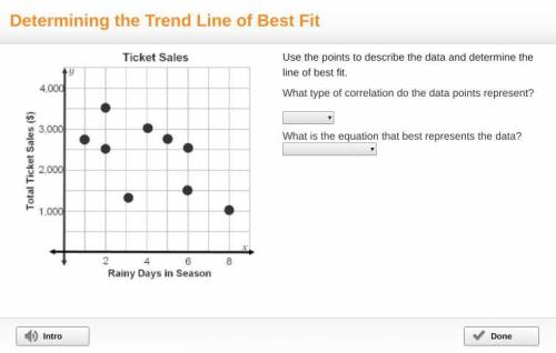
Please help! A graph titled ticket sales has rainy days in season on the x-axis and total ticket sales (dollars) on the y-axis. Points are grouped together and decrease. Points are at (1, 2,800), (2, 2,500), (2, 3,500), (3, 1,400), (4, 3,000), (5, 2,800), (6, 1,500), (6, 2,500), and (8, 1,000). Use the points to describe the data and determine the line of best fit. What type of correlation do the data points represent? What is the equation that best represents the data?

Answers: 2


Other questions on the subject: Mathematics
You know the right answer?
Please help! A graph titled ticket sales has rainy days in season on the x-axis and total ticket sal...
Questions in other subjects:

Mathematics, 19.02.2021 22:30

English, 19.02.2021 22:30

History, 19.02.2021 22:30


Mathematics, 19.02.2021 22:30
Mathematics, 19.02.2021 22:30


