Scatter Plots - Quiz - Level H
Question 3
The scatter plot below shows the relationship...

Mathematics, 31.03.2020 20:42 ctyrector
Scatter Plots - Quiz - Level H
Question 3
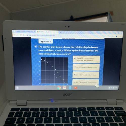
The scatter plot below shows the relationship between
two variables, x and y. Which option best describes the
association between x and y?
There is no association
between the variables.
As x increases, y decreases.
As x increases, y increases.
As x decreases, y decreases,

Answers: 3


Other questions on the subject: Mathematics
Mathematics, 21.06.2019 23:30, ashiteru123
The average daily maximum temperature for laura’s hometown can be modeled by the function f(x)=4.5sin(πx/6)+11.8 , where f(x) is the temperature in °c and x is the month. x = 0 corresponds to january. what is the average daily maximum temperature in may? round to the nearest tenth of a degree if needed. use 3.14 for π .
Answers: 1
Mathematics, 22.06.2019 02:30, rconyers00
Apossible wavelength for the color blue is 0.000000492 meter. which of the following is a reasonable estimate for this wavelength for the color blue? a. 5 × 10⁻⁶ m b. 5 × 10⁷ m c. 5 × 10⁻⁷ m d. 5 × 10⁶ m
Answers: 2
Mathematics, 22.06.2019 05:00, lindirogers19
Find the least common factor denominator for these two rational 7/x^2 and 7/5x
Answers: 1
You know the right answer?
Questions in other subjects:

Mathematics, 03.02.2020 16:04
Mathematics, 03.02.2020 16:04

Biology, 03.02.2020 16:04


Biology, 03.02.2020 16:04


