
Mathematics, 15.02.2020 12:41 itislyz
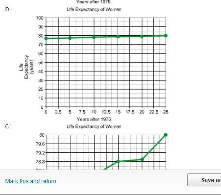
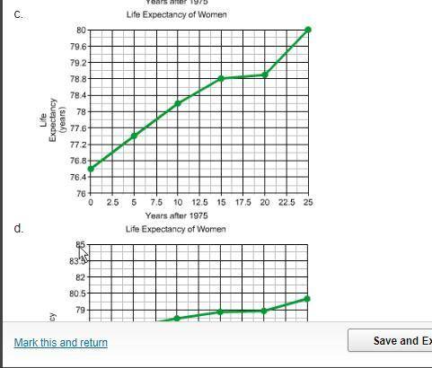
Which graph makes the increase in life expectancy from 1975-2000 appear to be relatively small?
I Believe it's option C but could be wrong


Answers: 3


Other questions on the subject: Mathematics
Mathematics, 22.06.2019 01:50, joycewingate919
Whats the theoretical probability of popping a polka dot balloon? express your answer as a fraction, decimal and percent solid 15 polka dot 5 striped 17 plzz me due tomorrow
Answers: 2
Mathematics, 22.06.2019 06:00, bryanmcmillianjr
Raymond took out a 25-year loan for $135,000 at an apr of 3.6% compounded monthly. if his bank charges a prepayment fee of 6 months' interest on 80 % of the balance, what prepayment fee would he be charged for paying off the loan 5 years early?
Answers: 2
You know the right answer?
Which graph makes the increase in life expectancy from 1975-2000 appear to be relatively small?
Questions in other subjects:


Health, 06.11.2020 16:40

Social Studies, 06.11.2020 16:40


Mathematics, 06.11.2020 16:40


