
Geography, 15.09.2021 17:50 4tazaouiamine1r
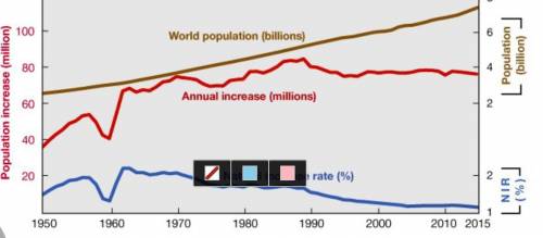
The figure represents world population growth between 1950 and 2015. Examine the figure and use it to answer the following questions.
A. When did NIR peak within this period, and what stage of the demographic transition in some regions is indicated by the shift that followed?
B. In 2–3 sentences, explain why world population would continue to increase, even if the NIR is decreasing.
C. In 2–3 sentences, describe one way in which data from this figure could be used to support a specific public policy initiative. Identify the initiative and connect it clearly to the data here.

Answers: 2


Other questions on the subject: Geography
Geography, 22.06.2019 21:30, richaeviney
Which country is the smallest island of the greater antilles
Answers: 1
You know the right answer?
The figure represents world population growth between 1950 and 2015. Examine the figure and use it t...
Questions in other subjects:

Mathematics, 27.08.2019 20:00
Mathematics, 27.08.2019 20:00

English, 27.08.2019 20:00

Biology, 27.08.2019 20:00
Biology, 27.08.2019 20:00

Physics, 27.08.2019 20:00


